UX Issues with Authenticator Apps
I recently got a new personal iPhone and realized that none of my accounts stored in Google Authenticator were restored via the iCloud backup restore process. I thought it might be time to switch authenticator apps to something like Authy, which supports encrypted backups and multiple devices (including desktop).
So, I decided to try out some iOS Authenticator Apps using a stand-alone, in-browser, MFA demo website (https://daplie.github.io/browser-authenticator/). I was surprised by some fundamental UX issues I uncovered.
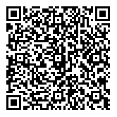
To test, I generated a “secret” for fake Issuer (Example Corporation) and fake Account firstname.lastname@corporation.example.com. Here’s the URI and QR code (feel free to steal my “secret”):
otpauth://totp/Example%20Corporation:firstname.lastname@corporation.example.com?secret=XOJ4YXLNDHB7OLQFIIYW6E3NEXA5IEIE&issuer=Example%20Corporation&algorithm=SHA1&digits=6&period=30
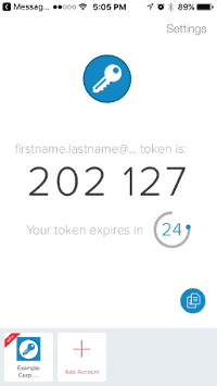
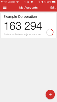
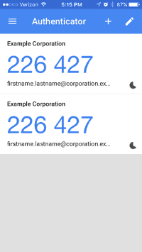
Now for the UX problems I found with these apps since my iOS device set to a larger font and I used longer than “normal” Issuer and Account values.
First the Authy iOS app, which uses a small square box for the truncated Example Corp... issuer and even more truncated firstname.lastname@... account. There is no excuse since Authy has so much white space to work with here. Also, notice how unreadable that light grey text is on a white background.
Next was the Microsoft Authenticator iOS app, which showed the full Example Corporation issuer, but truncated the firstname.lastname@corporatio... account.
Then was the LastPass Authenticator iOS app, which shows a larger and full Example Corporation issuer and a truncated firstname.lastname@corporation... account. However, they could have moved the countdown timer up to make room for the full issuer and avoided that grey text.
Last was the Google Authenticator iOS app, which showed the most information with the full Example Corporation issuer and a less truncated firstname.lastname@corporation.ex... account. However, why are there two entries for a single QR code camera scan? Before you answer “user error,” I tried this twice and got the same result.
I was surprised they all had issues. I even rotated the device for each app, hoping for more screen space, but no effect.
I guess you get what you pay for. It looks like the market could use an Authenticator app built by a UX team.


